Monday, 23 February 2015

RSA project

For this project we have to create a short 1 minute animation that gives a visual image of the audio that is playing. The audio will be a clip of a talk and we have two options. One is based on design and the other it based on curiosity.

The first thing I did was to research previous RSA animations to see what has been done before. I found a few of the animations as they were difficult to find.
Most of the animations were drawn or at the very least, digital so i wanted to do something different and I think stop motion would be a good idea.
I then listened to both clips and I was able to visualize the clip about curioisty more than the design one so I think the curiosity clip is the one I should pursue.
I then began researching the word curioisty which means:
curiosity
kjʊərɪˈɒsɪti/
noun
noun: curiosity; plural noun: curiosities
  1. 1.
    a strong desire to know or learn something.
    "filled with curiosity, she peered through the window"
    synonyms:inquisitiveness, interest, spirit of enquiry;
    informalnosiness
    "his evasiveness roused my curiosity"
  2. 2.
    an unusual or interesting object or fact.
    "he showed them some of the curiosities of the house"
    synonyms:peculiarity, oddity, strangeness, oddness, idiosyncrasy, unusualness, novelty More


I also found a few quotes relating to curiosity:
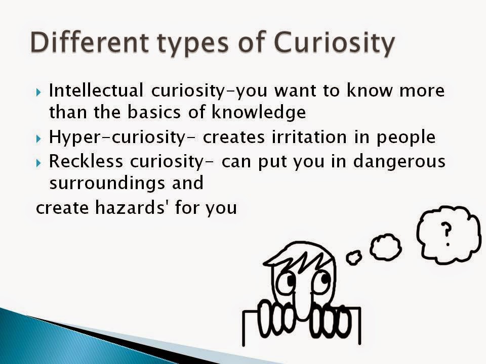
As well as this, I also discovered that there are different kinds of curiosity which I find really interesting:
Then next step was to listen to my chosen clip more intently and I took the script from the compainy website and underlined keywords which I thought were important. Since I didnt really have any ideas, this was the perfect place to start as inspiration spawned from it.
I then realized that as listened to the clip and read through the script, I could see different things for each keyword, so I wrote them down to help me build up an idea.
Since the animation had to speak to multiple people, I wanted the protagonist to be someone everyone could relate to which is, also I wanted to use a material that is easy to move and looks rather childish which is why I chose to use plasticine.
The next step was to research placticine animation and things turning into other things as my idea was now to simple take the keyword visuals I thought of and morph them into each other.
I found this animation which has some really nice plasticine morphing in it.

http://www.youtube.com/watch?v=GSzCLf8tjP4

I also found this rather famous claymation animation. Its a little peculiar but really shows how much detail you are able to go into using just plasticine or clay.

https://www.youtube.com/watch?v=uUtEtUD-sSg


My inspritation came from an advert I recently saw on tv which was an advert for a company called Amego loans which I very much enjoyed:
 https://www.youtube.com/watch?v=UQDVIE_SoJ8
Another  form of inspiration came from my childhood in the shape of morph from art attack. A simple little clay man.

I then made a storyboard and tried to time it as best as I could:

UPDATE: I created my animatic using my storyboard. It was very quick as I only needed to add a few in between shot since my storyboard was basically my key frames:

https://www.youtube.com/watch?v=mbLdWlETFP8&list=UUwZxxNPxE08ugFY1I8Tmcgw

SECOND UPDATE: I have now started to animate it. I set up my little studio over the christmas holidays and began shooting it.


The animation is now finished and edited. It went exactly as planned but the final shot of the world spinnin looked a little plain so I changed it to have a few key words surrounding it so that it didnt look too boring. I really liked how effective the plain white background was as your attention was not drawn to anything other thant the character and his interactions.


If I could have done anything differently. I would have used a different material for the main character as plasticine was very tricky to work with because it constantly got dirty, left marks everywhere and one of the arms kept falling off. I would have used modelling clay as I am familiar with that material. The only reason I didn't use that is because I wanted the animation to be really colourful and plasticine gave me that opportunity.
FINISHED ANIMATION:   https://www.youtube.com/watch?v=8oDsg8L0qeY


Friday, 6 February 2015

2 minute film

Just like last year, we have to produce another film, only this time, it will be two minutes long. I already had one idea in mind and then I came up with a few more as backups.

Idea 1
The first idea was about a rich business man who sees a homeless person struggling to survive on the street. One day as he is about to have lunch, he looks out of the window and sees the homeless man rummaging through bin in an alleyway and feels sorry for him. He then takes his lunch outside with an umbrella, sits with him and shares his lunch with him.
As you can see i expermented with super sculpey and made a few examples of what the head could look like since it would be animated in stop motion. Even though i have added colour to the drawings, the actual animation would probably be in black and white to add an artistic effect to it.
Here's the design for the homeless man character. The clothing would be actual fabric instead of sculpted and painted which I think would give it a really good effect.

The inspiration for this idea mainly came from an idea of a single shot i had. I had a sudden vision of the business man lifting a silver lid off of his lunch which would then cut to the homeless man lifting a lid off of a bin. From this i then created a whole idea around that.
As well as this my inspiration came from a music video I saw a long time ago by a band called 'Keane'. However, I have spent a long time looking for it and can't find it anywhere. It seems to have been replaced by a live action video instead.

Idea 2
The next one was about a big dinosaur watches as a ball rolls towards him, stops and grows two legs. It stumbles around and grows two more legs. It then grows a head and neck and then finally a tail to become a mini version of the big dinosaur.
This was a little sketch of what I thought the transformation steps could be.
I came up with is idea when i was makin my model for my RSA project in plasticine. I was modelling a man which at some became an animal and i began to think about transformations and whether that idea could be used. Since plasticine really didnt work well with me and sculpey is a lot easy to use, I made a few models out of sculpey and decided that the original pink colour could look quite cute.

Idea 3

My final idea wasnt that good and was basically just to mae sure I had a final backup in case the other didnt work out.
The elements (earth, fire, water and air) are in human form and they must never meet, but when water and fire do, they end up falling in love.
Here is the water element character, i designed him to be quite cocky and arrogant. He uses a wand which he carries in a holdster to channel his element and he ends up falling in love with the girl of fire.
This is girl I designed to be fire. Unlike the water element, she can channel her powers naturally through her hands. Interestingly, fire is labelled as a destructive element whereas she uses her powers for food, helping and healing people. She is also sweet and innocent.


My inspiration for this one came from the film Guardians with Jack Frost and the show avatart the last airbender. Also I have always had a curious fascination with fire so that also gave me some ideas.
Conclusion
I think im gonna choose the second idea witht the dinosaurs as i can see myself having more fun with that one. I can make it look cuter and the background does not need to be anything fancy as I can have a pure white background and that would look good.

I have made the models and came to the conclusion that i needed to put a foam body in the large dinosaur. I need to animate the neck and head which meant that I had to put and armature into it so that I could move it without the sculpey forming back into its previous shape. I then got a piece of foam and sanded it down to rememble the shape of the body. This helped in two ways. The first was so that I didnt use a lot of scupley because the body is rather large and thick and to get that amount of sculpey would cost a lot. The second thing was that it gave me an anchor to put the wire neck armeture into so that it didnt slide around inside the model. I wasnt able to put an armeture inside th smaller dinosaur as my plan is the make it as I go along since the dinosaur will be morphing into its final form as the animation progresses.

I have now finished my 2 minute film and a lot of things went wrong but I managed to turn it around and get it finished. I used Dragonframe which is a very good program for stop motion animation as it enables you to set the opacity low and you can see the current frame compared to the last frame. Also when you connect the camera you are uusing to dragonframe, you are able to see on screen what the camera is seeing. Unfortunately, I did not set the camera up properly so that when I had finished, even though what i saw on screen looked good, the actual photographs were all massively over exposed, essentially, I couldnt use any of it. However, when looking though the files, I noticed one that said 'Feed' which is basically a backup of the pictures you saw on screen and they looked fine so I thought I could maybe use them. I put the file on my hard drive and sorted them all into shots since they were all on only one shot and then put all the shots together and it looked pretty good. The overall appearence was a little flickery but that was bacause it was from the feed and the camera.
Then I had the massive task of editing out all of my rigs and since I didnt know how to mask in after effects, I used photoshop and spent the entire night going through it frame by frame and editing out the rigs.

Before editing

After editing

I then thought about what music I would like to use. Since the general theme was happy and bouncy, I wanted something that would reflect that so I went to a site called Incompetech which has royalty free music and found a song called 'Life of Riley' which I thought worked really well with the animation.
Another thing that went wrong was I secured the egg down with a little bit of hot glue as suggested by a teacher so that it would not move when I was drawing the cracks on it but when I had finished and tried pulling the egg off, it cracked and left a little bit of the egg on the green screen. I really tried to remove it but I couldn't so I ended up unclamping it, pulling the green screen down and reclamping it so that I could continue without having egg shell in the middle of where I was working.
If I was to do this project again, I would definitely start it earlier and do some test shots to make sure the camera was in focus and the apeture was ok. I would also add in some more lights to make sure the green was not reflecting off the models as when I came to attempting to put in the backdrop, I discovered that the green light was boucing off the models making them green so that when I removed the green backdrop, it also removed little pieces of the models making the overall apperarence of the film messy. For this reason, I made two versions of the films, one with a background and one without and put them both on my youtube channel. I personally like the one without a background as it looks cleaner and more professional compared to the other one.
Without background-  https://www.youtube.com/watch?v=hJ0ncc_1C30

With background- https://www.youtube.com/watch?v=iUkG2aF35Ko&feature=youtu.be