Tuesday, 9 December 2014

Woodland creatures Design work


For this project we have to think of 3 animals that exist in a woodland environment and make them into characters suitable for children. In order to do this I had to have a look at what woodland animals there are and see if the give me inspiration.


 After a quick google search I found this a website which has a few common woodland animals on it. The two that stick out to me are the fox and the mouse. This is because these are two animals thatmost children know about and can be made into characters with ease. I decided to look more into the animals and see if I could draw them.  As you can see, the fox is rather cute and I believe that if I try and give it a cartoon look such as the image from the animation ‘Fox and the Hound’, I think children would like this character. As well as this, the simple colours make it easy to draw and would be simple to animate if needed as it wouldn’t be too difficult to replicate multiple times.
Mouse
 

Next I looked at mice. Mice are typically timid, so my immediate thought was to make him the complete opposite and make him extremely brave instead. The good thing about creating a mouse character is that they often stand up on their hind legs so making my character do that would not be anthropomorphising it. Mice have been used inmany animations before such as mickey mouse or the rescuers, as seen above.


Lyrebird
Next I thought about typical children’s characters and what the characters are. The more I thought about it the more I saw that most characters could be seen as role models. A common role model for a child is an adult, such as a parent of a teacher. I then searched around for what could be an interesting animal that could also be a role model.
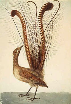
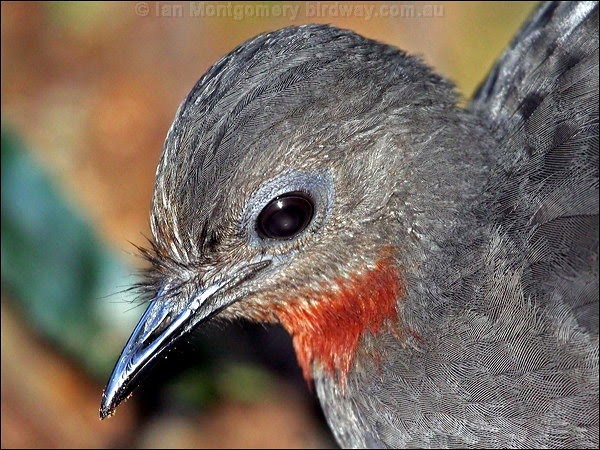
A while ago I came across a bird that could replicate any sound it heard. This bird was called the Lyrebird


The Lyrebird is amazing as in the video, it doesn’t just imitate other bird calls perfectly, but there were some loggers close by and it copied some of the sounds it heard such as a car alarm, a chainsaw and even the car radio. As well as this it also has a beautiful peacock like set of feathers in its tail which I thought would be very interesting to draw. I thought about how I could include its vocal ability into a character as well as creating a role model and came up with the idea of a teacher, possibly a music teacher and the bird could teach other birds to sing.

Another idea I had was a wise owl, playing with the stereotypical symbol that all owls are ‘wise’. My first thought was that I could do an owl sitting in a rocking chair with glasses on, reading stories to the other animals. Unfortunately, after a little research, I realised that a character like that had already been created in ‘Winnie the Pooh’.


Evolving the Character


I didn’t need to think much about how I could turn these animals into characters because as soon as I saw the animal, I could see what kind of character they could be.
When I saw the fox, I instantly saw a little fox that loves adventures which lead me to create an adventure fox. In order to show his adventurous side in the form of physical objects, I decided to give him a safari helmet and I let his ears stick through the helmet as I thought it looked rather cute. After looking at the character I then gave him binoculars around his neck just to make him look like he is ready to go on an adventure.
Next I looked at the Lyrebird. At first I wasn’t sure how I was going to show that the Lyrebird is a teacher, it needed something that would show she is a teacher. This was when I thought of the old teachers hats.

Character designing

Since the bird has quite a round head I thought this hat would work rather well and add the appropriate look to the character. I also gave her a pointing stick as a prop.
I then began creating some drawings to see what the character could look like.
After that, I experimented with a variety of colours to see what colours looked best.
I decided that the first one looked the best even though I went on to slightly alter the colours later on in the project. I then made a little information sheet about the lyrebird.

The next thing i did was see how I could make the character more interesting so I thought about the role I wanted the character to take which was a music teacher so I developed the tail to look more interesting. I drew an image of the tail resembling treble clefs notes.

I then made a little information sheet about the lyrebird


I found a fact that says that the lyrebirds name originates from the musical instrument (Lyre) and then I put those two images on the sheet which is when I realised I could make the tail look like the lyre instrument and that the character could possibly its tail. I then went on to developent the tail further.
Character modelling
The next thing I did was begin to model the character. The first thing I did was draw a life size drawing from the front and the side of the character and then I began to form the main body out of foam.

The next thing I did was to measure out some wire to make sure the legs were able to support the character. I made the wire longer than it needed to be so that I could form the legs around the wire and then fix the rest to the base of the set. I then covered the whole thing in sculpy and formed feet and an open beak.

 I also made a little mortar board hat so that you can recognize it as a teacher.


The next stage was to make detailing parts such as wings and the tail. Each wing has 13 seperate feathers and I carved in some musical note detail to make them look more interesting. I was a little stuck on how i was going to make the harp tail. At first I was going to use a paper version with a thin wire skeleton inside. However, I found a problem with that method as I would have needed to fold the paper and that would have looked reallly bad. I settled on a sculpy harp with a wire armeture inside.
After that I attached the harp and the left wing onto the body, making sure that it looked like the wing was holding the harp up. The model was almost finished at this stage so I added details such as wire to make strings on the harp, facial features such as nostrils on the beak, eyes and eyebrows, detailing on the legs, a ring of feathers around the neck and I even used white spirit to smooth the surface of the model and then scratch in some feather detail. The model was finished so I baked it in an oven.


Set designing
The final step was to build the set for the character to go in. I knew from the start what I wanted the set to look like. I wanted it to be a classroom to show off the role of the character but also have some woodland elements to show the location of the set.

The images above show two different colour variations to the walls and the charatcer placed into the environment.
Making the set
I started with the base that my teacher gave me and cut it into the shape I wanted with two walls so that it looked like it was the corner of a room. The first piece I made was the blackboard which was made out of black card and lollipop sticks. I stuck a piece of cream card on the walls, attached the blackboard and then began the long process of cutting lollipop sticks to size and sticking them to the walls.
I also found an old watch at home which I though would look really good in the set so my dad changed the battery so that it actually worked, grinded off the sides and we set it into the wall by partially drilling into the wall.
As you can see from the picture above, then set is really taking shape. I was going to use more lollipop sticks to make the floorboards but that would have been very time consuming, so I made a floorboard pattern on photoshop, printed it off and stuck it to the base.
I thought about what makes a classroom and realised that I didnt have any students for the character to teach so I made a few little birds. Each is slightly different than the other. One is normal, one is a little fatter, one is wearing glasses and the last one has its wing up like its answering a question.
I also wanted to make it look like the animals have found human items and recycled them in some way. I used straws and matchboxes for the desks and used bottle tops and matches to make stools for the students. I decided not to paint them so that you could see exactly what they were.
I added a few little extra details such a more lollipop sticks to give an ending to the bordering on the walls and two music posters, on of which I had in my music classroom when I was in school.
The finished set and character


I painted the little birds nice bright colours to attract the young target audience. I also made the branches out of pipecleaners to make it look more child friendly.


I painted the bird in accordance to my designs, apart from making the head the same colour as the body. I also made the legs a bright yellow. After I had painted it, I realized that the back of the bird looked pretty blank, so I thought about how I could fill that space. As I was shopping for items for the items, I came across a bag of feathers that I thought would look good on the bird. I drilled very small holes into the back of the bird and arranged a number of the feathers like the plummage of a peacock which looks very good and gives a nice contrast compared to the solid material of the bird. As well as this I also highlighted certain details with a felt tip pen.

I really like how the model and set turned out and I thoroughly enjoyed this project. I dont think there is anything I would have done differently as I am so happy with how everything turned out.


Sunday, 28 September 2014

Snoreeze Advert

We have been given a brief to come up with an animation for the product 'Snoreeze' which is a product that helps reduce snoring for people who are prone to it. We have to come up with an advert that they will be able to use to promote their products. The first thing I did was to do research into their products. Snoreeze has a few variations of products such as lozengers, nasal sprays, oral strips etc. all designed to reduce snoring. The next logical step was to look at their previous adverts to see what has already been done and what they liked. One advert that interested me in particular was once that focus on sound levels rather than the effects to sound has on other people. This was interesting as it was different compared to the other adverts. The advert compared snoring to a walrus call, a fog horn and a few other sounds complete with a sound meter to show the difference. This was interesting as this was one of the only advert that didnt go down that road.
Others showed couples in bed having trouble sleeping due to one of them snoring.


The next thing i looked at was the product itself. Luckily the brief gave me pretty much all of the information i needed such as:
how long the product lasts
the products availaible ( lozengers, oral spray, nasal strips, throat spray)
the target audience (women buying for their husbands)
During the clients presentation she mentioned that sheep worked well in previous adverts but we are not allowed to have animals as the main characters. My ideas do not have animals as the main characters but they do include animals so that means I had to do some research on animals that are related to sleep such as noturnal animals such as bears, bats, owls etc...

The final thing I did was look at different art styles and animations in order to create my design board. The design board really helped me as when I was looking for images for the board I suddenly thought of a really good medium which I will write about when I update this blog for my ideas post.

I finshed my power point presentation containing my three ideas. The first idea was a woman that can't sleep as her husband is snoring and she has tissues in her ears in an attempt to block out the snoring, suddenly a crack forms in the bed and the bed splits apart into two cliffs to symbolise the marriage falling apart due to the snoring problem. Then, a sheep fairy shows up with the product and and sews the two halves of the bed back together. I thought this idea would look better digitally drawn in photoshop.


The second idea was a woman trying to sleep but her husband is a variety of loud items such as:
a jackhamer
an airhorn
and a cannon
the product is used and the items turn back into her husband and she is able to sleep peacefully.
I like this idea and I thought that I should give it a twist in order to make it stand out from everyone elses ideas so I thought about animating it in a flipbook style. I took this idea further and developed it so that each loud item is animated on seperate flipbooks and then at the end the flipbooks are put together and it forms the snoreeze logo. I got the inspiration from a previous snoreeze advert that focuses more on sound.
https://www.youtube.com/watch?v=ir5KcojxVUo
The third idea was a little more aggressive than the rest. The woman is angry that her husband is snoring, she goes to hit him with a hammer but the the narator talks to her. A hand comes down, takes the hammer off her and give her snoreeze instead so that the man now sleeps silently.

 UPDATE: They did not choose my idea, I can't say I'm not dissapointed but I have been put in a good group so i dont mind. My group is doing Janelle's idea and it's Janelle, Kate, Paul and I. Janelle's idea is a woman sleeping and dreaming of sheep jumping over a fence, but suddenly the sheep turns into a lion and she wakes up to realise that the roaring was actually her husband snoring. However, they changed her idea slightly by wanting it to be in Kates art style.
We began discussing ideas and different materials we could use.
As a team decided on using hard materials e.g.cardboard paper, sandpaper, bark, wood etc for the real world and soft materials such as silk, felt, cotton and t-shirts for the dream world as it emphasises the fact that its a dream.
I took on the role of being in charge of the sheep shot and the shot of the face to show how to use the product.
We went to the fashion department class room to look in their scrap boxes for inspiration for materials and it really helped. just using those samples I managed to create a test sheep model which helped me get an idea of what the sheep might look like.
I really like this design as it is only in 6 pieces and can easily be moved around for animating.

I then thought about what it might look like when it is jumping over the fence from the side as one shot is from the side.
https://www.youtube.com/watch?v=OSFwKQpw_kA&feature=youtu.be

I then thought about the instructional face shot. I will be animating it with string but i could also animate it using pipe cleaners, wool, paper clips, wire etc. The shot will be of the string coming in and forming a face which will then morph into a clock face. This shouldnt be too hard to do if i use the right materials. A started a mock up version using a metal necklace to get an idea of what it would look like.
This will not be what I'm going to use, I was just seeing how easy it was to form the string around an image of a face. The difficult thing will be to make sure that the string still retains the shape of the face as it is moving round to form the clock.

As well as this I also thought about different slogans that we could use for the end of the advert and I came up with 7 different slogans that could be used which were:
*Snoreeze, helping you through the night
*Sleep with ease, Snoreeze
*Sleep soundly, without the sound
*Snoreeze, for happy sleepers
*A remedy for quiet natural sleep
*The only sleep prouct you will need
*Your new best friend
However when we sent these to Snoreeze, they wanted us to use a different slogan which they provided for us.

We then began preparing to make the animatic. Kate and Janelle went and bought materials for us to use. We decided to use materials such as paper, cardboard and tissues for the real world shots to give it a hardened look and materials like felt, wool like material, string, and fabric for the dream world to give it a soft look. As we started to make the animatic, I continued making the pieces for the sheep shot and then went to get help for the instructional part of the animation. I went with Mario and he showed me how to make the shot in Aftereffects as we were running out of time to do it in stop motion. Im not sure if the real animation will have the Aftereffects part or not as we will have to discuss that.
We used the multiplain to make the animation as it allows us to have a lot of detail on various layers yet still enables us to animate easily.

After we had finished taking the images, Paul was scheduled to put the animatic together. However, Paul did not show up on the day we took the images and he never told anyone so we were worried that he might not do the animatic like we asked. In order to make sure we had a backup, I put together the animatic as well. I later learned that Paul had done it but each of us missed some things out that the other didn't. Janelle then took both animatics and put them together to make one animatic. After that I adjusted the sounds so that everything was right.
I really like what we have created and think it looks good. It gives us a good idea of how the final animation will look and the timing was perfect.
Link to animatic:   https://www.youtube.com/watch?v=vxzX0ulVnT0&feature=youtu.be

UPDATE: I have now finished animating my section. It went pretty well and didn't take very long. I ended up using Janelles style of sheep in order to keep things consistent.


Link to animation:  https://www.youtube.com/watch?v=_7cTsm6CJjE&feature=youtu.be

I used lollipop sticks for the fence since I thought they might look good, were easy to work with and were cheap to buy. Kate had a sheet of modelling grass which we agreed would look the part and then Janelle went out and bought some black fabric that was covered in stars. Kate helped me set up the lighting and I booked out a camera and the room so that I could us the multiplane to animate it. I also helped Janelle the day afterwards by making the front facing fence for her. I used Dragonframe to animate it. This was the first time I had used Dragonframe and didnt really know what to do but  got the hang of it fairly quickly and the final result was very good. Kate edited all the sound effects and things together and then I took those files and pieced them together in Adobe Premiere. When I edited it together, I put my shot to the upper right of the womans head because that is where you normally see a dream bubble placed but Kate thought it should go in the bottom right as then it could be shown bigger and would not be blocking other animation. However, during our presentation, a representitive from snoreeze thought that the bubble should go above her head where I first placed it. We then all agreed that the bubble could go down in the bottom but have little bubbles coming off it to further convey that it was her dream. The people from Snoreeze really liked our advert but just needed the bubble editing and Pauls end shot resizing as certain parts of it would get cut off because they were not within the tv lines. As well as this, Paul needed to give us the Aftereffects files that he used to make shot with his wasnt in, so I managed to contact him and he gave me the files.
When putting everything together, I opened up a dropbox account and gave everyone the name and password to use as a sort of central hub to upload all the shots so that all the video clips and files could be found in one place.
This was extremely useful as if there was anything anyone needed, it could be found there and we could all download it. As well as this, we all kept up to date on everything using a facebook conversation we set up. This was pretty much invaluable as sometimes a group member was not in but we could still talk to them using the conversation.
 As well as this, Kate and Paul gave me some editied shots and I put them into the video I had put together. The video is now done with just a few little adjusted still need doing. I have enjoyed this project but would probably have animated my part sooner so that if there were any adjustments then they could have been done with time to spare. 
Link to advert: https://www.youtube.com/watch?v=GqS40rQZIIU&feature=youtu.be


Monday, 22 September 2014

My Youtube channel

Here is a link to my Youtube channel. Any animations I create relating to my course will be uploaded there.

                       https://www.youtube.com/channel/UCL8aU_V7gXMJjZyHlQEMuiA

The start of university second year and my summer assignment.

Well, I'm back from holidays which was fun but those times are over and its time to work! Over the summer we were given an assignment to create three misanthrope characters and create a front and side walk cycle for one of them.

So, since I didn't know what a misanthrope was, I had to do a little research into misanthropes. After a little time I found out that most villians in films are misanthropes, as they are people who hate or distrust other human beings. In my presentation I mentioned villians such as The Joker, Malificent, The Hulk, Lots O', Lord Voldemort etc... Most of these villians do not really have a motive for hating other people, they just don't like them. I did initially have an idea for an evil genius scientist who is really bad at inventing but I didn't have enough ideas for more villains so I decided to turn away from the villian aspect of misanthropes.
After doing a little more research I looked into common misanthropes that exist in normal society, which was how I came across the idea of goths, elderly people and the homeless. Goths are misanthropes because they choose to be different, they go against society by choosing to dress differently, wearing very dark colours and spikes all over their bodies making them look almost aggresive. This is how I came up with my gothic character 'Dawn'.

As you can see, she is a typical goth girl but is also incredibly shy due to being bullied at school. I decided to have her in her school uniform but add her own touch to her look with a jet black trenchcoat, a spiked neck choke and purple streaks in her hair. I like this design as she looks so innocent. Dawn doesn't hate other people, she just doesn't trust them.

My next idea was inspired by someone who is different than everyone else and as a result, doesn't trust anyone because no one understands him. This is when I came up with Kevin.
This is my first design for Kevin. I used a roundish body to resemble a human but it could never hide who he really is. He is the only robot living in a society existing entirely of humans making him untrustworthy because he is different. Kevin has a common office job in an attempt to fit in, carrying a brief case and wearing a leather hat which fits over his antenna. Kevin is a rather placid robot but his misanthrope feature comes into play when his AI side sometimes takes over as his orginal purpose was to destroy all humans.
Here is the second design of Kevin, I decided to remove the body and put his arms and legs on the head to give him an interesting shape. It would have been quite fun to animate this shape as the movement would have been very different compared to a normal body. Yet I still wasnt sure about it, and so I redesigned him a final time.
This was the third and final design of Kevin. I decided to stick with this design as it looks more like a stereotypical robot with a proper body that is square and very unhuman like which works well for this design. After some thought this would have been easier to animate compared to the last design as I would have just had to worry about the feet walking whereas in version two the whole body would have to twist to walk making animating much more difficult.

I realized that some elderly people are misanthropes, but against the youths around them. Everyone has heard of old people catagorizing all teenagers as 'hoodlems' and treating every single teenager the same. For some reason I have always found old librarians rather creepy, just the thought of someone breathing down your neck as you read just sends a shiver down my spine. Using this personal experience I was able to come up with my final character called Dorris.
This was my first design for Dorris, a 70 year old librarian who looks innocent at first, appearing old and frail with a limp and hands drawn up to resemble a dinosaur. She moves slowly through the isles, peering out through her oversized glasses at anyone who touches her books. If she sees you damaging her books she will move faster than anything you have seen and you will be out the door before you can blink. I took inspiration from the 'Monsters University' librarian for the fear factor through her temper and inspiration from the mother in 'Dispicable Me' for the appearence. However I wasn't quite happy with her shape, partically in her face shape so I redesigned her and came up with a design I was happy with animating.
This is the final design of Dorris. I completey changed her look apart from a few things such as the hair, the large glasses and the short stumpy legs. I decided to make her much rounder and it suited the stumpy old lady appearance I was going for. As well as this I made the body one large shape and just the head, arms and legs would move which would make animating a lot easier. I changed the colours of the clothing too so it was easier to see what was the skirt and what was the cardigan. Below are two links to Youtube showing my front and side walk cycles for Dorris.

side walk cycle- https://www.youtube.com/watch?v=cD3KTZCcAAA&list=UUL8aU_V7gXMJjZyHlQEMuiA

front walk cycle- https://www.youtube.com/watch?v=8XpiZzj-13M&list=UUL8aU_V7gXMJjZyHlQEMuiA&index=2